 |
| Try not to get stabbed in the hand in 2019... or any other year for that matter. |
Saturday 29 December 2018
New year resolution
Tuesday 11 September 2018
Robert McGinness, the classic Bond illustrator.


I’m sure the illustrator Robert McGinness was at one time the most successful American illustrator, he seems to have been everywhere and done everything for everyone. His catalogue is replete with prestige clients, magazines, film productions as well as the bread and butter work, which is as what we all know, is what really pays the bills. He was at the top of his game, to my mind, in the sixties and seventies producing work in the painterly style that had been the look for illustration since about the fifties. McGinness’s work though, is stylistically rather more versatile, he seems to be able to wander across the line between stylisation and realism at will. It’s generally possible to put one’s finger on a particular talent an artist has and say I like this or that about their work, the way they paint flesh or pose figures. It’s harder to do that with McGinness because he doesn’t rely on style to sell the picture.
McGinness had quite a prominent association with the James Bond film franchise doing poster work and it seems from these examples, pre-production visualisations. In case you’re not familiar with the concept of pre-production visuals, they’re often used to sell a prospective idea to would be investors but they’re also passed around, shared between a creative team to get them working in the same direction. I have my doubts about these examples, especially the one with Bond perched on coral, it seems a little too after the fact to be pre-production but that’s just conjecture. It’s also a slightly odd painting though, it’s odd because it’s rendered like a studio photograph. The figures look as though they’re standing in front of a photographer’s wall, even so far as the seamless junction between floor and wall. Illustrators are or were used for visuals because they don’t suffer the limitations of photography, they can make pictures up and draw or paint them. Oh look let’s give the Pharaoh lots of gold ornamentation, let’s make King Kong reach out at the plane, that kind of thing, so what purpose is there to painting a dreary studio wall, you might as well take a snap. I suppose though, Connery being a star, wouldn’t be available for photo shoots without some stiff financial incentive.
There is also some eroticism here, Domino in the midst of hoiking her knickers off, or on but she has a strange and asymmetric face that reminds me of a kipper. She stares perpendicular to the picture plane with a vacant gaze. Bond though is attentive and alert, what’s that a would be assassin amid the palms – no it’s just a mouse peeking through the photographers skirting board. He definitely looks as though he’s finished but she’s caressing that phallus as though business still needs attending. What is that thing anyway, don’t tell me that it’s a spear gun harpoon, since when did they come gold plated. It seems like I’m being critical doesn’t it, which is odd because I’m a McGinnis fan and fans are supposed to regard the object of their fanishness with uncritical fascination, oh well – bill me.
Although a somewhat less finished effort, the other picture, the one with the couple cavorting in the ocean, is more satisfactory. It doesn’t seem to me to be realistic, I would expect more angular and contorted tangle of limbs for a pair sinking in the ocean. Then there’s the myopia of the aquatic environment that would make staring into your lover’s eyes or even in their general direction – quite difficult. It’s a fantasy though, so these things don’t matter, the water is there just to give context. The foam and spray evoke a sense of motion as well as a lend a suggestion of passion, while foreshadowing the culmination of their union.
McGinnis gives great extremity, hands feet, legs arms there’s always some elegance and poise about them, sometimes his figures remind me of birds, the structure of their limbs being delineated so finely. Here he’s opted to use the background colour in Domino’s legs giving them a feel of translucence or iridescence. Of course, she’s a fish in her element not the cold kipper served up on a slab in the other picture. Interestingly, although Bond’s figure is more solid, more in water than of it, this translucency is also present in his torso.
There you go I hope you enjoyed the pictures, I know it seemed like I hated the one with Bond seated but I don’t really, I actually quite like it and I think it’s a fine piece of technique, it’s just that my thoughts on it tend towards the critical.
Sunday 19 August 2018
Will Crawford


Came across this guy Will Crawford who used to be an illustrator during the pulp era in the US this is his header, as they're termed in the credits, for the contents page of Adventure vol. 10, No. 6. Notice the pound sign hasn't yet been adopted to denote issue numbers.
I cleaned the image up a bit and tried it in a few different colours, my preference is for the first one, which apes the feel of a faded pulp magazine.
Thursday 16 August 2018
The Virginian

Finally after two lengthy pauses, one of a week and a second of closer to eight weeks, I got through Owen Wister’s The Virginian (A Horseman of the Plains). That second pause was close to the end and I almost put the book down for good because the romance phase of the narrative didn’t really have much appeal to me.
Yeah it is a good book, it’s an historical western rather than a genre western because Wister was actually there during the period he was writing about. For me a book becomes a genre piece when the conventions it uses and represents become fictional, as well as the narrative within those conventions. More than that though, it’s a must read if you’re at all interested in westerns, both the genre and the history, because it is one of a very few quality western historical novels.
There’s a few shocks I store for you if you’re familiar with the TV series from the seventies and are looking for an affable Trampas character, Wister’s Trampas isn’t just a rogue, he’s a thief and a suspected killer. The Virginian himself gets up to some pretty dubious goings on, as we find him playing a key roll in the lynching of some cattle thieves.
The Virginian is a book that finds itself on best westerns lists quite a lot but I kinda suspect that you’ll find that the people who compose those lists have rarely read it. In tone and metre, it’s closer to Jane Austen than Zane Grey and there is a depth to the relationships in the narrative, that’s not usual for a western.
There are some hiccups too, Wister drifts in and out of first person in an unstructured way that would have an editor screaming down the phone today but you do get used to if after a while. He also is a bit remise with his sense of place, quite often when you’re not quite sure where things are happening.
The Virginian is also noteworthy for being the progenitor of the western school mistress stereotype, yes here is where you’ll find her, Miss Molly Wood and I’m sure it’s no surprise to learn that she’s the source of the romantic interest. Molly though is a bit gamier than her latter-day imitators, having to fight off rogue Indians with a pistol as she rescues her wounded lover, who she finds at death’s door.
I hesitate to recommend it if you’re into westerns, if you’re into 19th Century fiction, it’s probably more your thing. If you want to give it a go there’s a facsimile of the first edition available at archive.org.
Wednesday 15 August 2018
A glass full
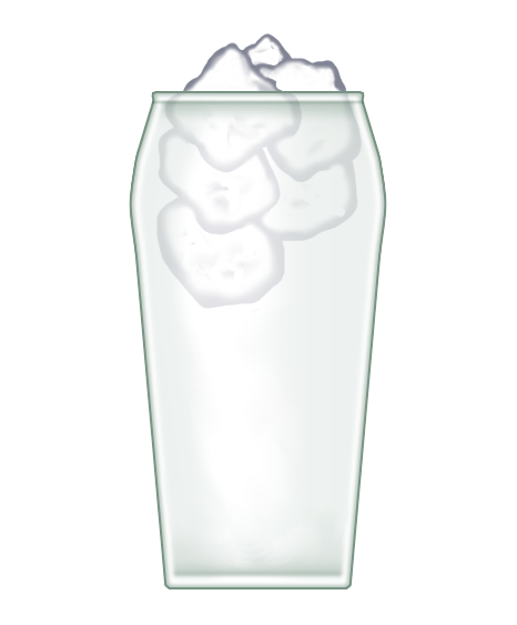
Puzzle: A glass of water sits on table in a room at 56° Fahrenheit. The glass is a 1 pint/20 fl oz measure that is full to the brim with water, floating in that water is some ice. Protruding from the surface of the water in the glass is a mass of ice equivalent to 1 fl oz, that is 1/20 of a pint.
When the ice has melted, how much water will have overflowed the glass on to the table?
Please excuse the rather rushed illustration, I knocked it up quickly.
Monday 13 August 2018

Tuesday 7 August 2018
Now in color
After a while I cottoned on that is was the controls that were mal aligned and not a fundamental flaw in the technology as I had previously thought. So I would try and remedy the situation and point out that if the colour control was adjusted, that we would no longer need to wear sun glasses while watching the telly. This advice was universally met with aghast disbelief and derision accompanied with worlds like: ‘It’s so dull… muddy… there’s no colour’. What this tale illustrates is that colour is or the views on what colours are correct or most pleasing are subject to some—disagreement. Professionals who work with colour, spend a lot of time gauging their colour rendering and endlessly fussing over details in an effort to get it just right and yet aberrations like Man of Steel still occur. So it’s no surprise that Joe Bloggs occasionally makes the odd goof while working on colour images. I myself look at some of the images I’ve coloured and spot that I generally make the blacks too dense and the blue and reds too saturated. When it comes to electronically scanned comics these flaws in colour reproduction are quite common, sometimes they’re manifested so intrusively they completely ruin the reading experience.
 |
| Ugh. |
 |
| Ah much better |
As you see I applied some colour shifting over the colour gamut, to moderate the colours and I think it works quite well. The next image though is also a bit too saturated, although because the tones are more even, it’s not quite so revolting.
 |
| See? |
When I attempt to adjust the colour though, it doesn’t seem
to work too well, it’s looking a little too pasty to my mind.
 |
| Too pasty |
Perhaps
if I just try to moderate the reds that would work.
 |
| Mm--not convinced |
Sunday 5 August 2018
Yay! More fun.
There are two duck hunters Bob and Ted and they compete between themselves and the other members of the Selsey Duck Hunting Association for the prize of Best Duck Hunter. The prize awards skill rather with a gun rather than total kill count so it is awarded on the kill rate, that is the number of ducks killed divided by the number of shots fired: ducks/shots. So if hunter A, kills 50 ducks for 100 shots and hunter B, kills 70 ducks for 200 shots, hunter A wins because 50/100 is greater than 70/200, simple yeah?
Well look at Bob and Ted's ducks/shots stats over the last four years
It might surprise you to learn that Ted has consistently been awarded the prize of Best Duck Hunter. How is it possible for Ted to have won all the awards for best duck hunter over the period covered by these statistics?
You can award yourself points through the following guidelines:-
Spotted the answer instantly: congratulations you're a genius -- 10 points.
Scratched my head for, no more than a minute and a half, then the light dawned: still pretty smart, perhaps you're just a bit slow today -- 5 points.
Did the sums in my head, worked it out after an hour or so: we're still good, it's just that you'll never be a rocket scientist -- 3 points.
It's been a day and half and my head hurts but I got it in the end: don't worry about it too much, you can tie your own laces can't you? -- 2 points.
I used all the battery power on my calculator and/or created a spreadsheet, mulled the puzzle over every night for week until it got so bad the misses threatened to take off with the kids then finally after days of woe and agony I realised the answer was staring me in the face all the time: there there, perhaps it's time for your nap now -- 1 point.
What's a duck? Oh dear, you know when people all seem to be talking really slowly to you... -- 0 points.
Looked the answer up on the internet: get lost you're beneath contempt -- -infinity points which by the way, means you can never score.
This is easy the answer is, ducks are cute, and futher more I can't prove it with... [edited] ...so there: oh hi, while indeed it's true many people find ducks to be cute, I find this answer to be somewhat wanting. Though the good news is that you do win a prize, it's a special prize, nice and shiny just for you and everyone else who's -- special.
Well look at Bob and Ted's ducks/shots stats over the last four years
| Year | Bob ducks/shots | Ted ducks/shots |
| 1 | 70/100 | 69/100 |
| 2 | 126/350 | 85/250 |
| 3 | 75/100 | 70/100 |
| 4 | 100/300 | 65/200 |
It might surprise you to learn that Ted has consistently been awarded the prize of Best Duck Hunter. How is it possible for Ted to have won all the awards for best duck hunter over the period covered by these statistics?
You can award yourself points through the following guidelines:-
Spotted the answer instantly: congratulations you're a genius -- 10 points.
Scratched my head for, no more than a minute and a half, then the light dawned: still pretty smart, perhaps you're just a bit slow today -- 5 points.
Did the sums in my head, worked it out after an hour or so: we're still good, it's just that you'll never be a rocket scientist -- 3 points.
It's been a day and half and my head hurts but I got it in the end: don't worry about it too much, you can tie your own laces can't you? -- 2 points.
I used all the battery power on my calculator and/or created a spreadsheet, mulled the puzzle over every night for week until it got so bad the misses threatened to take off with the kids then finally after days of woe and agony I realised the answer was staring me in the face all the time: there there, perhaps it's time for your nap now -- 1 point.
What's a duck? Oh dear, you know when people all seem to be talking really slowly to you... -- 0 points.
Looked the answer up on the internet: get lost you're beneath contempt -- -infinity points which by the way, means you can never score.
This is easy the answer is, ducks are cute, and futher more I can't prove it with... [edited] ...so there: oh hi, while indeed it's true many people find ducks to be cute, I find this answer to be somewhat wanting. Though the good news is that you do win a prize, it's a special prize, nice and shiny just for you and everyone else who's -- special.
Tuesday 31 July 2018
Just for fun
Derek owns a fruit and veg stall and is taking inventory of his stock. He has 12 pineapples left over from yesterday and took 2 deliveries of 4 pineapples this morning. He writes this down and gives the calculation to Jimmy so he can tell a restaurant how many pineapples they're going to deliver. Jimmy rings the restaurant and tell them they're going to deliver 56 pineapples. How many pineapples does Derek have and why did Jimmy say 56?
Sunday 15 July 2018
The story so far...
Tarzan is the heir to the title of Lord Greystoke, born on the west African shore to his marooned parents, who both die tragically soon after his birth. He's saved from certain death by the anthropoid ape Kala, as she grieves for her recently deceased child. Brought up by his new mother, Tarzan leans the ways and language of this band of apes, which is how he acquires his name, which means white ape in their primitive tongue.
By happenstance Tarzan discovers the abandoned hut of his parents and their remains. Many of the belongings of his parents survive unscathed amid the decay and detritus of the abandoned hut, amongst these are language tutorials and dictionaries, from which Tarzan learns to read and write English. He accomplishes this prodigious feat without any tuition, with only the material available in the hut.
His mastery of English is so complete that when he finds that visitors from abroad are intruding upon his hut, he is able to draft a note and leave it for them.
THIS IS THE HOUSE OF TARZAN, THE
KILLER OF BEASTS AND MANY BLACK
MEN. DO NOT HARM THE THINGS WHICH
ARE TARZAN'S.TARZAN WATCHES.
TARZAN OF THE APES.
That's the story so far, now what is the inconsistency with this narrative?
Monday 9 July 2018
Red -- not pink
So a while ago I found a collection of representations of the Edgar Rice Burroughs character Deja Thoris by various artists.
One of those artists being Bruce Timm who did a quite lovely little number in colour. Well it is lovely, except that the colour's wrong, she's supposed to be red not shocking pink, Burroughs generally describing her as copper coloured.

So I re coloured her as, making her coppery as all red Martians should be rendered. It was just a quick thing, so the eyes need some attention, probably some highlights on the eye lids and under the brows along with some general tidying up. While I was colouring it, it was interesting to note, that despite Timm's highly abbreviated style, his anatomy is pretty accurate. The only deviation from my interpretation of anatomy being the straight clavicle he gave Deja Thoris in this picture, which is open to some discussion. Women can have very curvy clavicles or slightly curvy but rarely straight ones, although when dancers take up first position, it looks as thought they're straight.

Wednesday 9 May 2018
Open mic
So last Friday 4th May, I broke my record of successive bouts of cold feet and dove, not quite headlong, into the limpid pool of performance art, that is: I took part in an open mic event at a local cafe. If by chance you're contemplating a similar excursion, I can state that, while the anticipation of such an endeavour might be uncomfortable, cold sweat, palpitations etcetera, the actual performance is really quite a pleasant experience. In fact I'd go as far to say that's it's quite invigorating, a bit of a blast even.
The nerves stayed with me a bit through the performance, I couldn't find my best poem, even though it was right there in the notes. That's a bit of a shame really because it was a bit more mellow in tone than the stuff I did use, which was, except for the opening number, all quite intense. Even with my opener though, I may have detected a sharp intake of breath in response to the opening verse.
The nerves stayed with me a bit through the performance, I couldn't find my best poem, even though it was right there in the notes. That's a bit of a shame really because it was a bit more mellow in tone than the stuff I did use, which was, except for the opening number, all quite intense. Even with my opener though, I may have detected a sharp intake of breath in response to the opening verse.
Friday 27 April 2018
Whose diary?
A good few years ago now I made a visit to the Turner collection at the Tate Gallery. I was with a friend, I'll say she was a close personal friend, so it was kinda natural that we'd go on a visit to London together. I'm not exactly sure how I was expecting the visit to got but I was really looking forward to it, however this close personal friend decided for, whatever reason, that she take the opportunity to demonstrate how blithe indifference, thoughtlessness and lack of regard for others can turn a simple trip into a nightmare. Almost as soon as we crossed the threshold of the establishment of interest she started with her 'I don't think much of this... it's just a mess' and 'my little niece could do better'. Okay so one might expect a little dismay at first from someone who hitherto had little exposure to the world of art history or Turner. After some judicious instruction one might expect to quell most such disquiet to find it displaced by a sense of inquiry spurred by curiosity at a new experience. Er--no such luck in this case, not only did my ministrations fall on deaf ears, she seemed intent on pressing her opinions repeatedly and, I'm afraid to say, extremely vocally.
I've been on dozens to trips to art galleries and good few of 'em with friends who were totally unacquainted with the world of fine art and this is the only instance that one of those companions behaved in such a manner. I feel I should stress now just how tedious and embarrassing her behaviour became. It seemed as if the mere sight of a group of gallery goers staring in quite appreciation at a painting, would goad her into action. She'd saunter up to 'em as close as she could and say something like, 'Tuh! I don't get what the fuss is about'. Since that day I've spent many hours wishing I'd found the strength of will to strangle her to death in front of the Fighting Temeraire. I'm sure after the testimony of the many gallery goers who witnessed her behaviour that day, I would've been acquitted on the grounds of provocation and mental suffering.
Anyway, what this little anecdote is meant to illustrate is the principle that inconsiderate behaviour doesn't have to be extreme to cause distress and offence. It can be something as seemingly innocuous as person expressing an opinion on art. I feel sure this kind of thing has happened to you, I personally think of this as my Alf Garnett day. It was like one of those instances where Alf would be attempting to listen to the radio or maybe watch the Queen's speech on telly. Alf would be trying to get a bit of culture and his efforts would be sabotaged by Dandy Nichols and the other philistines who surrounded him. It is though in George Grossmith's Diary of a Nobody, where I feel this kind of experience has been most aptly exemplified. If ever you find yourself having a bad day at the hands of a person or persons like my close personal friend grab a copy of the diary to reassure yourself you're not alone.
Thursday 19 April 2018
Q1
Is it me or is every novel published after 1997 either overwritten by approximately 30,000 to 60,000 words or essentially a short story buffed out to 45,000 words and type set with double spacing?
Tuesday 17 April 2018
Thursday 1 March 2018
"Conan, destined to wear the jeweled crown..." et cetera...
How about some links to the first published Conan short story by Robert E Howard? I've reformatted the text into something on the smaller side of a trade paperback, and there's even a choice of font. Bembo is the standard for pretty much every pulp publication and mass market paperback. Garamond though has what are called text figures and they read nicer. This is actually quite a nice version of Garamond with the exception of a wonky z.
The Phoenix on the Sword by Robert E Howard, Bembo font
The Phoenix on the Sword by Robert E Howard, Garamond font
The Phoenix on the Sword by Robert E Howard, Bembo font
The Phoenix on the Sword by Robert E Howard, Garamond font
Tuesday 2 January 2018

Subscribe to:
Posts (Atom)