As promised this my attempt to explain the colouring technique I use with image editing software for drawings. Back when I used to do this regularly I used Photoshop, which is an excellent piece of software but the full featured version is way too expensive to justify for personal use, so I've started to use Gimp which is available free to download. Using Gimp was a bit of a painful transition, the source of much tugged hair and yelling at the monitor but if you persevere with it, it turns out to be a very usable alternative.
Right, first things first, scan your image as a greyscale or RGB image, you can scan an eight bit indexed colour image but you'll need to convert it to RGB or greyscale for the next step.
Clean it up as you feel fit, I use the Levels or Curves tool to adjust the blacks and whites. Once you've done that make sure your image is in RGB mode, if it isn't already. If you're working on a hight resolution image i.e. one intended for print there's a tip make life easier on machines with limited resources, see note 1 at the end.
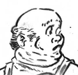 |
| Fig. 1 |
You should have something like Fig. 1, a greyscale image on a single layer. You need to perform an extra step before you can proceed. You need to separate all non white coloured pixels from the white, not as tricky as it sounds. You accomplish this by creating a new
channel then copy and paste the greyscale image into that channel.
Now create a new
layer on the image and use the channel to perform a
selection .
Now perform a
fill operation with black as your colour, you may have to
invert the selection first, as black is normally the default mask colour for channels.
Now create another layer and move it beneath your outline, perform a
select all and fill it with white.
Congratulations you've now separated your greyscale image into two portions, it's useful to name each layer as you go along, I suggest
Outline and
Base.
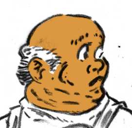 |
| Fig. 2 |
Now create a new layer beneath Outline and above Base and name it
Flesh or
Skin or whatever name takes your fancy. You can use the the brush tool to fill in your base flesh tone or perform a poly selection with the lasso or pen tools.and perform a fill. Choose a somewhat darker tone of flesh than that which represents the finished tone. This step is analogous to a coloured ink wash, over line work.
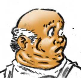 |
| Fig 3. |
Fig. 3 shows the basic modelling, this would be analogous to using opaque body colour over an ink wash. To do this create a new layer above your basic tone then use the brush tool to paint in the modelling. It's best to ensure that the colouring on this layer remains within the area defined by your base flesh layer, I use a selection to ensure this but you could probably link the layers if you wish.
I generally perform this step using white and then set the opacity of this layer to some percentage.
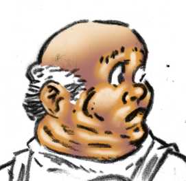 |
| Fig 4. |
Now we want to perform the shaded part of our modelling and this where I normally cheat. Instead of faffing with a brush tool I perform some boolean logic to short cut the task. Since our shaded areas are the opposite of lighter areas we should be able to use the computer to do the task for us, and it turns out that, if we've done our job properly with lighter modelling, this is in fact the case. So...
- First set the active layer to the one you painted in your lighter flesh tone on.
- Perform an alpha or transparency selection so that coloured area is the selected portion, in Gimp this is: Layer/Transparency/Alpha to Selection.
- Expand that selection, the amount you expand it depends on the resolution, some where between 5 and 12 pixels works for most screen resolution images, in Gimp this would be: Select/Grow for the appropriate dialogue.
- Now Feather your selection, this step is optional but you'll probably want to do it, the amount of feathering is resolution dependent, something less than half the amount you grew it is about right.
- Invert your selection.
- Set your base flesh layer to the active layer.
- Perform a selection intersect with the transparency on this layer, with your current selection, in Gimp this is: Layer/Transparency/Intersect with Selection
- Create a new layer, name it Flesh Shade.
- Perform a fill with your desired flesh shade colour.
The colour you use for your fill depends on the context of the image, for warm skin, use cool colours for the shaded area, blue or purple. For cool skin, warmer colours, something like a terra verte. In certain cases you may wish to create a reverse highlight, in which case you can ether use a lighter tone of your base flesh colour or a contrasting colour to compliment your flesh tone.
In most cases, I like to perform this step with a solid colour, in this case a blue, then use the layer transparency to moderate it. If you're using it for a reverse high light, you'll need to keep the colour solid.
 |
| Fig. 5 |
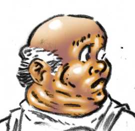
Highlights are optional, they're a different step from modelling because they represent reflected light at a coincident angle to the light source, therefore they're dependant upon your viewpoint. I generally only bother with them to indicate shiny surfaces. Keep them quite hard, on a separate layer, usually white on skin but moderated on shiny fabrics.
 |
| Fig. 6 |
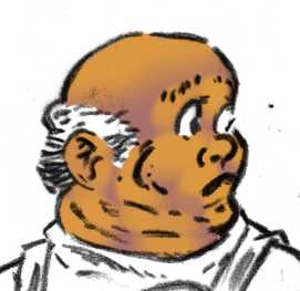
 |
| Fig. 7 |
Figures 6 and 7 are included to clarify some of the steps described above.
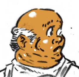
 |
| Fig. 8 |
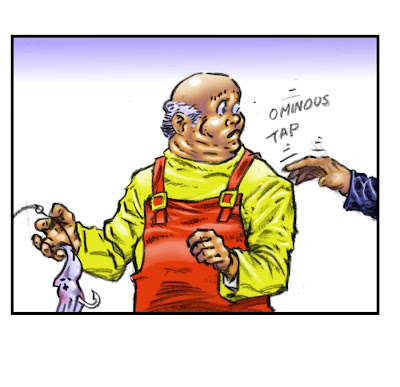
The image in context, funnily enough I'm not happy with the face on this so it'll probably be changed pretty soon.
Note 1. Human visual acuity is concentrated in black and white, so you can get away with low resolution colour as long as the tonal range is in high resolution. If you need to create high resolution images in can be easier to colour them at low resolution and then rescale them and add a high resolution black overlay.


